NEW LOGO

We are so excited to share the new logo for Silvercocoon!
Thirteen years ago, we worked with Outside the Box design to finalize our simple blue & white identity. The dots on either side of the name were intended to be forward thinking - suggesting www.silvercocoon.com - at a time when only big firms and agencies could afford to have a website. Those two dots carried our dream for the future.
It is almost unbelievable to think of how drastically the world has changed in less than 20 years. Technology, accessibility, and connectivity has drastically changed sales and marketing for designer-makers just in the last 10 years. With so much tangible change, I craved a new vessel to hold our newest dreams for the future.
As I expand my knowledge of metal-working, and deepen my skills as a silver-smith, it felt only fitting that we revisit our logo and brand to better serve my jewelry collection. I craved something with a bit more flexibility. A logo that can be used as a symbol and literally as a branding tool for my work. A simple element that could translate from website to print to packaging to product.
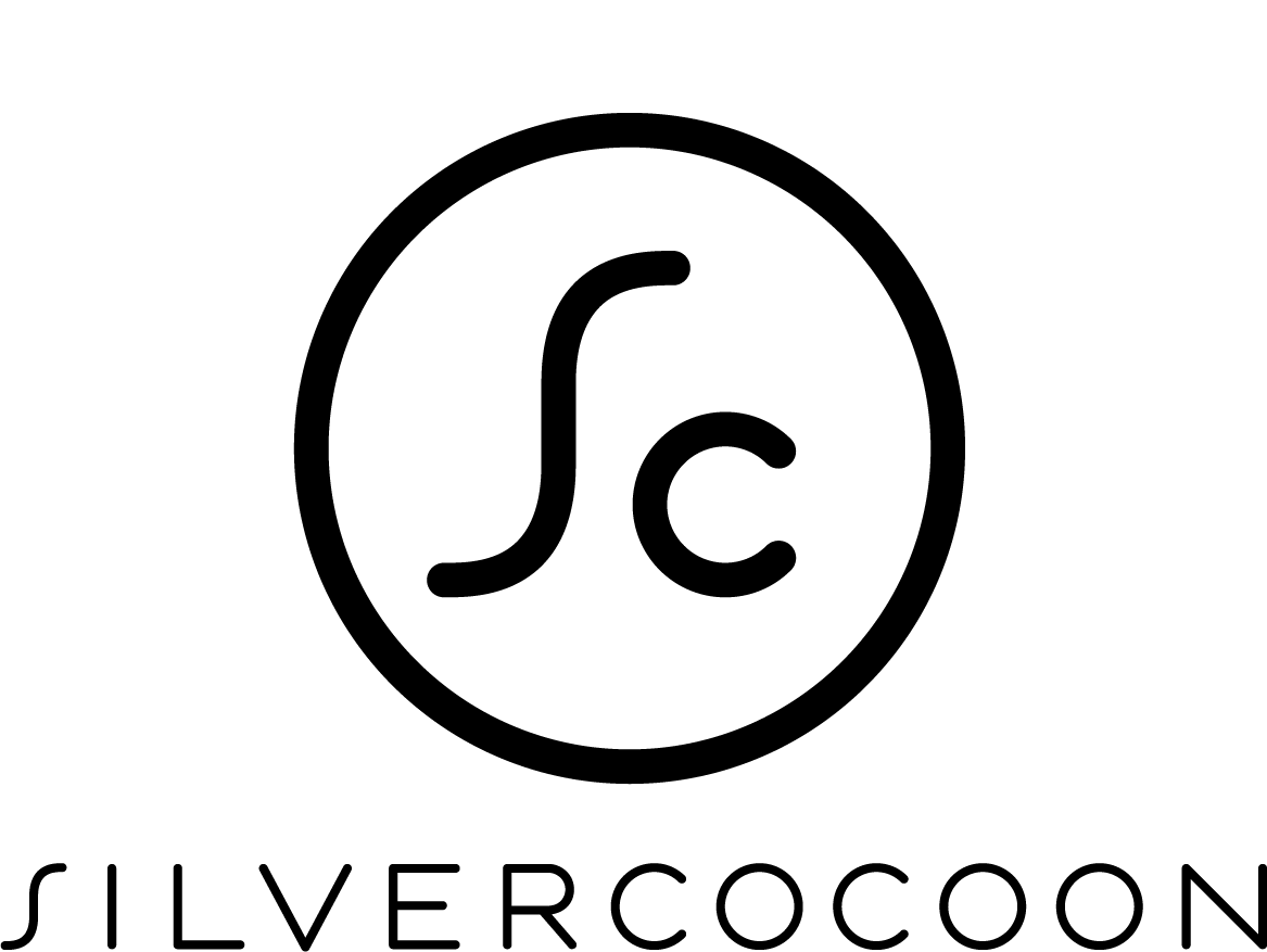
We enlisted my brother, Kai Salmela, a graphic-designer turned architect (which makes him greater than the sum of those parts) to develop something for us. He is well aware of the Silvercocoon-intricacies of weaving together design services based business with the needs of selling product through wholesale, retail, and online means.
He came up with a simple, fresh, modern, and practical logo that is already being put to great use. The distinct S breathes new life into Silvercocoon. Pairing the S & c together in a circle is clean and contained and also flexible as we grow over time. Also, though he says it was not intended, I can't help but see the tail end & wheel of our Airstream camper ... the mascot and inspiration for our name way back in 2001.
Stay tuned as we work to incorporate this new logo into our Silvercocoon work going forward.